4 Weird Tips for Boosting Your Email Open Rate
We’ve already talked about best email marketing practices and tips for a good, healthy HTML email newsletter. These concepts are good practices and worth to be followed by email marketers.
But we all are in different environments; we have different online businesses and different subscribers’ databases. What works for us may not work for you and vice versa. Thus, the best tip you should follow is test your email marketing campaigns to find out what works best for your own subscribers and what doesn’t work at all.
Today I’d like to share with you 4 weird email marketing concepts which oppose common practices but may work for you under certain circumstances:
1. HTML email is preferable -> send plain text emails
The fact that the HTML email outperforms plain text messages in email marketing is undeniable. Not only does HTML email provide email marketers with great features to drive a higher recipient’s attention (images, colors, hyperlinks, etc.), it also makes it possible to track email opens and measure user interest towards provided content – advantage the plain text email doesn’t have.
So, in today’s world where nearly all commercial email is in HTML format, why use plain text messages as an alternative?
Marketing emails in the plain text format are so rare that they may actually stand out more in the ocean of image-rich HTML newsletters.
HTML email is associated with one-to-all communications when one marketer sends to the whole world.
Plain text email has a shade of privacy and associated with one-to-one communications like our personal messages to friends or relatives. Plus, plain text emails often mean something important like transactional emails.
If you are not ready to refuse HTML email completely, there is a good compromise – lite HTML when you use HTML at the top of the email (for example, logos, photos to reinforce your brand and recognition) and then the main content goes in plain text.
2. Unsubscribe link at the bottom -> put it at the top
Spam complaints are one of the factors that contribute to your sender reputation and determine the chances of your emails to be delivered. To minimize spam complaints, be sure to use an unsubscribe link in your email. And to encourage people to unsubscribe instead of hit the Spam button, put the unsubscribe link at the top of the message. Or, you may consider using the second unsubscribe link at the top.
At this point you may object that many people can click on the unsubscribe link placed at the top by accident and you will start getting false unsubscribe requests.
So, is an unsubscribe link at the top really a good idea?
I think it’s a good idea when you deviate from your regular email marketing practice, for example, you have an unusually long/short break between email campaigns, or you send the email that is not fully relevant to the subscriber’s interests.
3. People are already signed-up -> send them the opt-in link again
Why would you want to send the opt-in link to those people who are already subscribed? Seems stupid. However, there is a common sense in this idea.
People forward your emails to others who are not subscribed with you yet. After they read your great content or see your wonderful offer, they may want to subscribe themselves.
It may happen that people unsubscribed for your mailings but changed their mind some time later. They may find an old copy of your email and use the opt-in link to get into your list again.
So, find the appropriate place and include an opt-in link. You can add it to P.S, for example:
P.S. Did you get this email from a friend?
Subscribe to receive your own copies at
http://directemailsoftware.com –
it’s free, easy and beneficial.
You may object that people can go to your website and subscribe there. But…
- The more efforts they need to make to do something, the less desire they have to do it.
- Not every web site has an apparent sign-up form or link.
4. People don’t click the link to your “mobile version” -> add it all the same
To measure the interest of your “mobile” audience into your emails, you can add a link to a “mobile version” of your email and check if anyone clicks on it.
If the report tells you that nobody used the link, do you need to make your emails mobile-friendly?
You may record a few licks on the “mobile version” link but they don’t create the whole picture because:
- People often use their mobile devices to only sort the emails and delete unwanted ones. They see your message and leave it for reading later at home or in the office on their laptop or desktop computer.
- If your email is not HTML-rich, it may display well on a mobile device so there is no need for the user to click on the “mobile version” link.
As you see, link clicks don’t give you the real statistics about how many recipients read your emails on mobile devices.
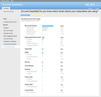
Instead of relying on link clicks to estimate your mobile audience interest, look at the “Email clients usage” report provided by G-Lock Analytics to get the exact picture.
If you don’t have an account on G-Lock Analytics yet, create it now for free and start tracking your email marketing campaign right away.
Email clients usage report on G-Lock Analytics

Click on the image to enlarge it
